Portfolio Details
Productively – Workforce Productivity Management Platform
Productively is a workforce productivity and performance tracking platform designed to help organizations monitor employee efficiency, optimize operations, and improve data-driven decision making.
The Productively platform was designed to help organizations monitor workforce productivity, track operational performance, and improve reporting visibility across departments.
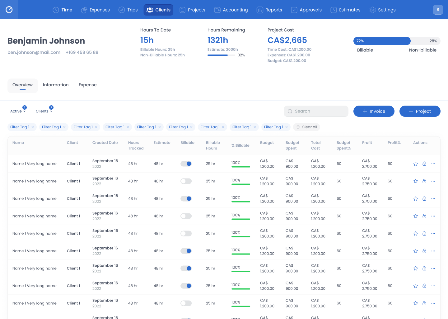
The system served diverse business users including managers, supervisors, and operational teams, requiring a clean and highly structured dashboard experience that simplifies large volumes of performance data.
Through stakeholder interviews, workflow analysis, and user research, several usability challenges were identified in performance tracking, reporting accessibility, and data interpretation.
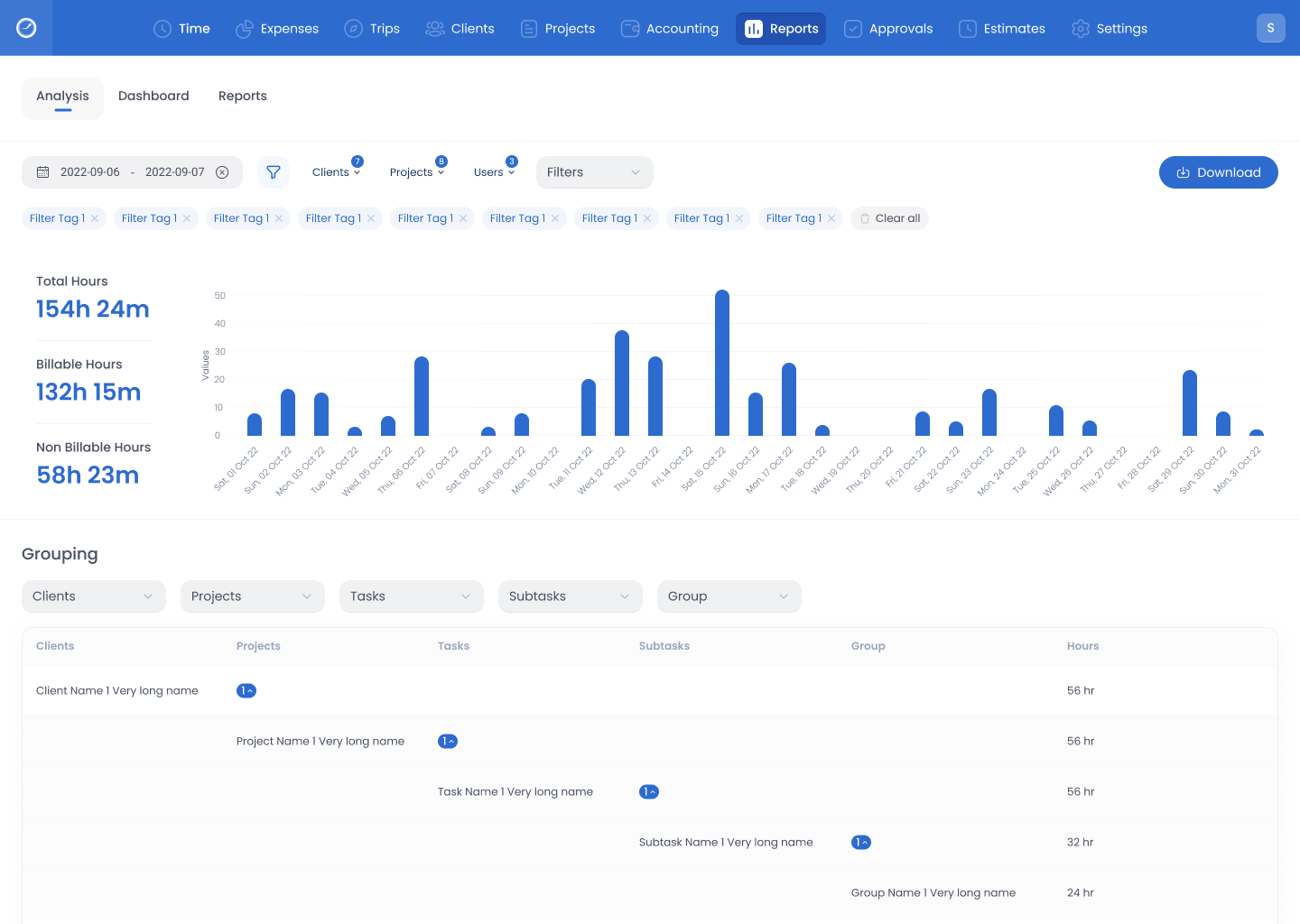
The redesign focused on transforming complex operational data into simplified dashboards and structured reporting systems that improved usability, visibility, and decision-making efficiency.
- Led UX strategy and dashboard redesign
- Conducted stakeholder discussions and requirement gathering
- Created user flows, wireframes, and high-fidelity UI designs
- Designed performance analytics dashboards
- Collaborated with product managers and developers
- Ensured usability across multi-role enterprise users
- Lack of centralized workforce performance visibility
- Manual and time-consuming reporting processes
- Difficulty tracking employee productivity trends
- Manual monitoring processes increasing workload
- Poor data visualization affecting decision making
- Lack of centralized monitoring tools
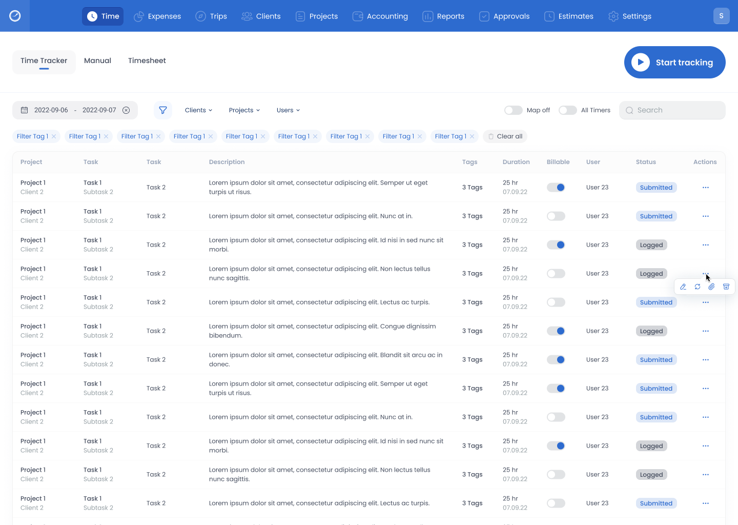
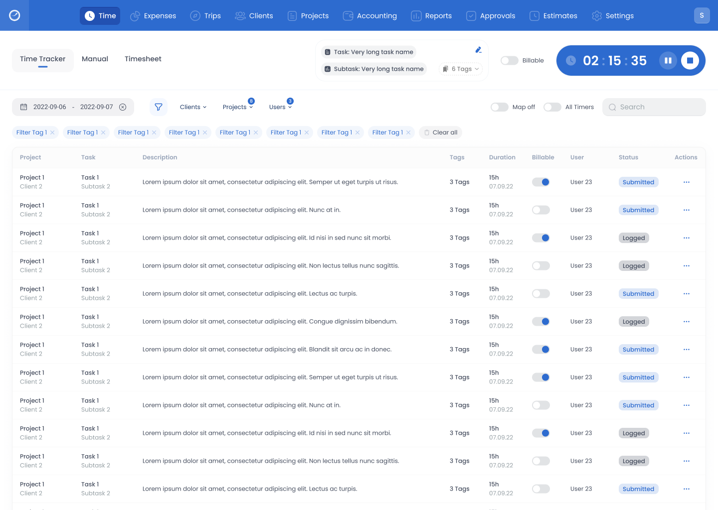
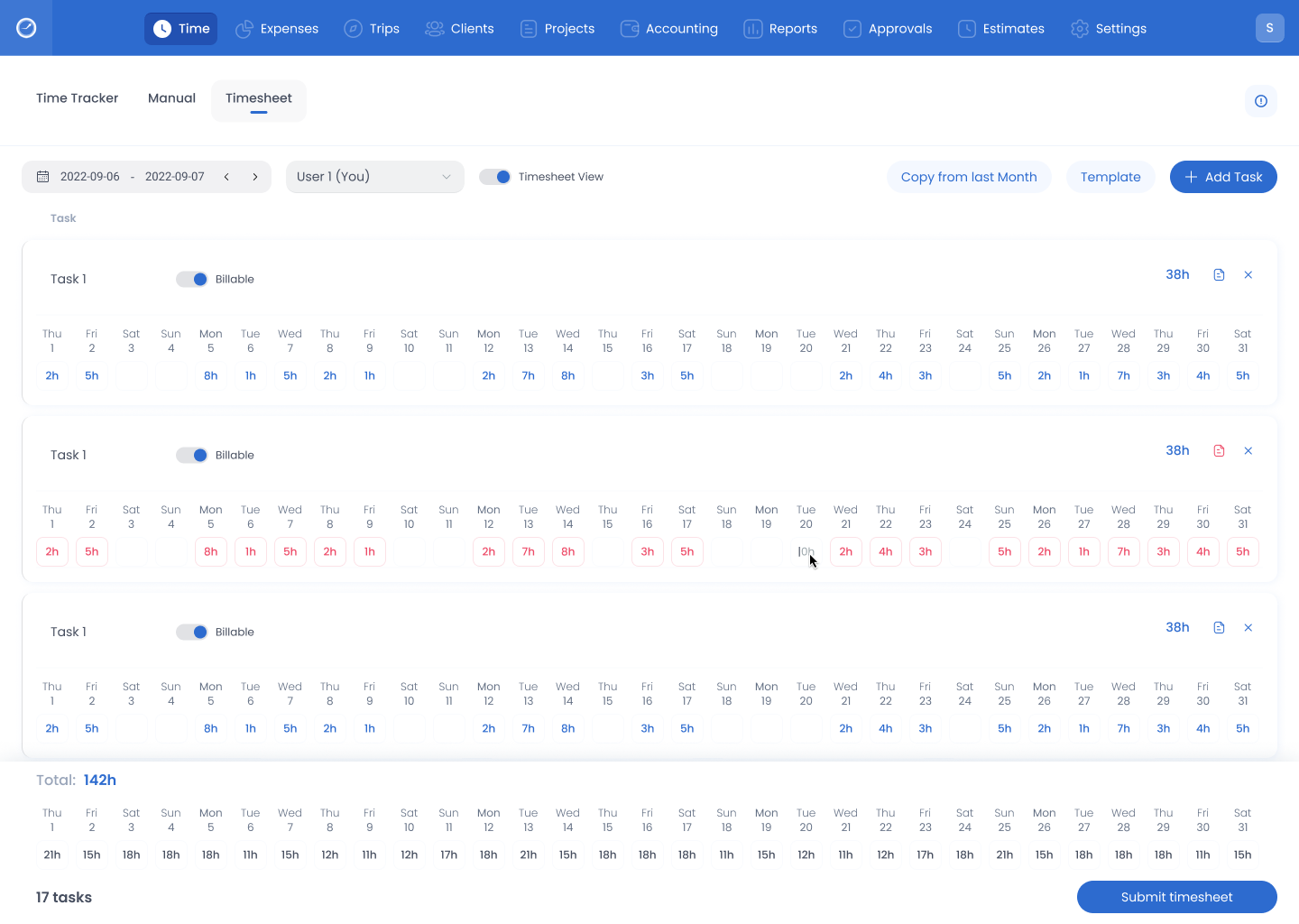
- Designed centralized productivity monitoring dashboards
- Introduced visual analytics with clear performance indicators
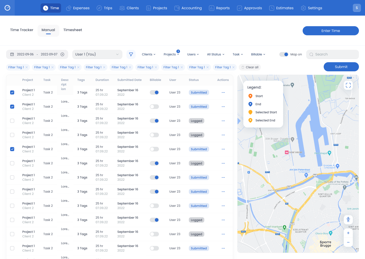
- Simplified reporting structure and data hierarchy
- Created user-friendly task tracking workflows
- Improved usability through structured dashboard layouts
- Established scalable UI patterns for future modules
Core Design Contributions
- End-to-end dashboard workflow restructuring
- Performance analytics visualization system
- Simplified reporting and data filtering architecture
- Consistent enterprise design system implementation
- Accessibility-focused UI improvements
- Role-based dashboard customization